The Feed
Product Design, UX/UI Design, Web DesignThe Feed
The Feed is an online market place for athletes to get performance snacks, supplements and training gear. They needed a way to customize their user experience to better serve up the products that an individual user would be more inclined to purchase.
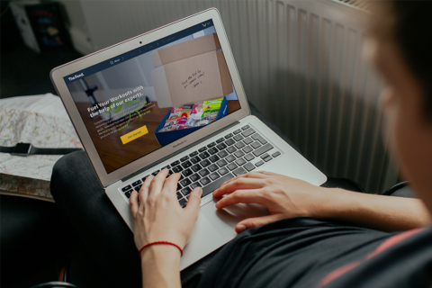
The solution we decided on was a personalization experience that could be accessed from the home page. We wanted user’s to fill-in-the-blanks in a paragraph, telling us their fitness story. Like ad libs for fitness.
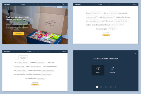
We did not want it to be some basic fill-in-the-blank experience. Plus, we needed to be able to control responses as much as possible so the system could properly serve up the best products based on users’ responses. So we created these full-screen modals for users to select their answers which made the experience more controlled and more visually dynamic.
We didn’t want users to feel trapped though. So we provided users with the option to exit this part of the experience and talk with a real-life representative from The Feed. However, we made sure to provide visual cues to motivate them to finish their personalized fitness story.
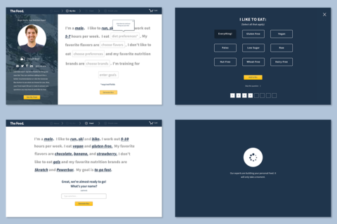
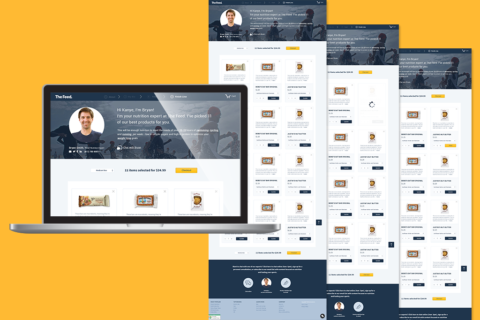
When users submitted their answers, they could see their “Personal Feed” which consisted products tailored to their needs or wants based on the inputs they provided. And they had the option to remove or add items in their cart before checking out.
When we tested early versions of the wireframe prototype, we learned that if we don’t ask enough questions, the user doesn’t trust that results will be accurate. If we ask too many questions, it becomes exhausting and users abandon the experience. According to our users, eight questions in a fun, ad lib paragraph was the right solution.
