META Skateboarding
Branding, Graphic DesignMETA Skateboarding
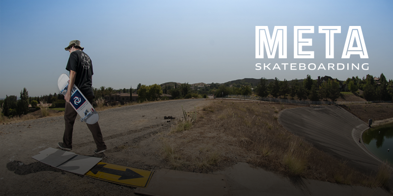
A local skate shop in Boulder, CO. approached us to create a graphic for a new line of apparel and decks. Unlike most skate brands, Meta Skateboarding has a clean and modern visual identity. We wanted to stay true to that identity, and give them something classic and bold.
Skateboarders see the world different than most people. They look at a staircase and see ways it can be used beyond it’s original intent. We set out to create a design for Meta that honors looking at the world differently. We created a visual element, designed for print, that goes beyond basic 2D design.
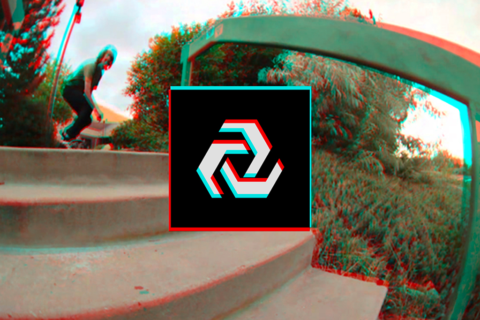
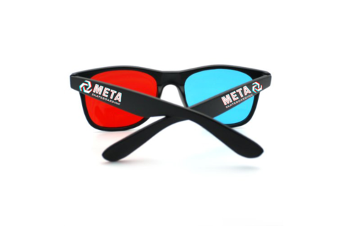
We wanted to celebrate seeing the world differently, in a very literal way. We threw it back to those classic red and blue glasses you’d to wear to see anaglyph 3D images.
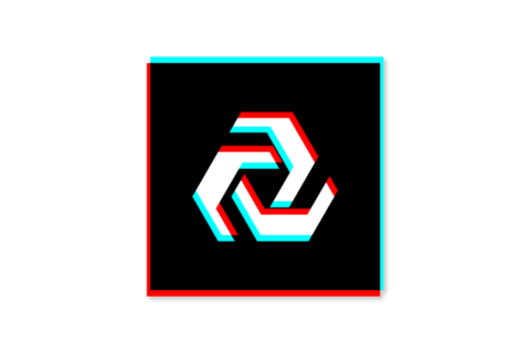
The shirt might not be clean, but that graphic is.
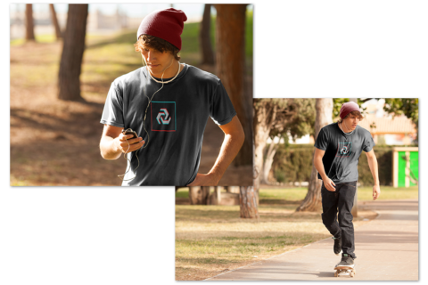
Skate decks.
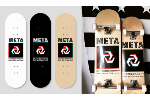
Since the concept came from classic 3D glasses, we figured make our own as marketing collateral.
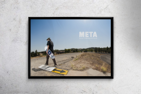
At the end of the day, it’s all about getting out and skateboarding.
Process: exploration and iteration. In this case, we stripped away almost everything and focused on elevating the mark.
