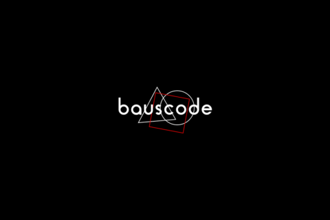
Bauscode
Branding, Graphic Design, IdentityBauscode
Bauscode is a creative technology agency based out of Denver, CO that specializes in software development and animation. They approached us to help develop their brand identity to be clean, sophisticated and unlike any other tech agency.
We started by learning how they arrived at that name, how they talk and feel about their own brand. From there we did some exploration to determine potential directions to take the identity. The voice and tone. We translated that into a series of images to get feedback and refine the concept further.
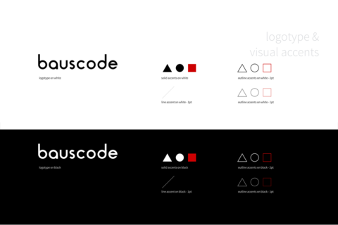
We arrived at a brand that was clean, sophisticated, simple and compelling. We used the logotype for the official corporate identity and gave them the opportunity to more broadly utilize the shapes as visual accents.
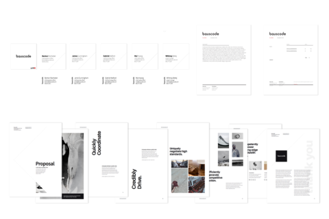
Business cards, email signatures, proposals and invoices. We made sure that anything their clients see and touch has the same level of sophistication, balance, and intention that we’ve established with the brand.
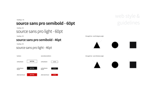
Guidelines for web.
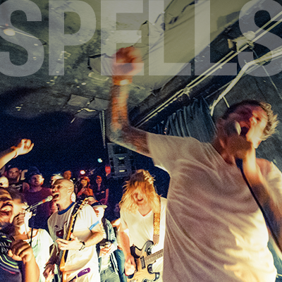
We developed some digital brand assets, such as hero images for web, that bauscode would have fun animating and playing around with.
We chose square business cards as a way to tie back into the visual elements of the brand.
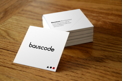
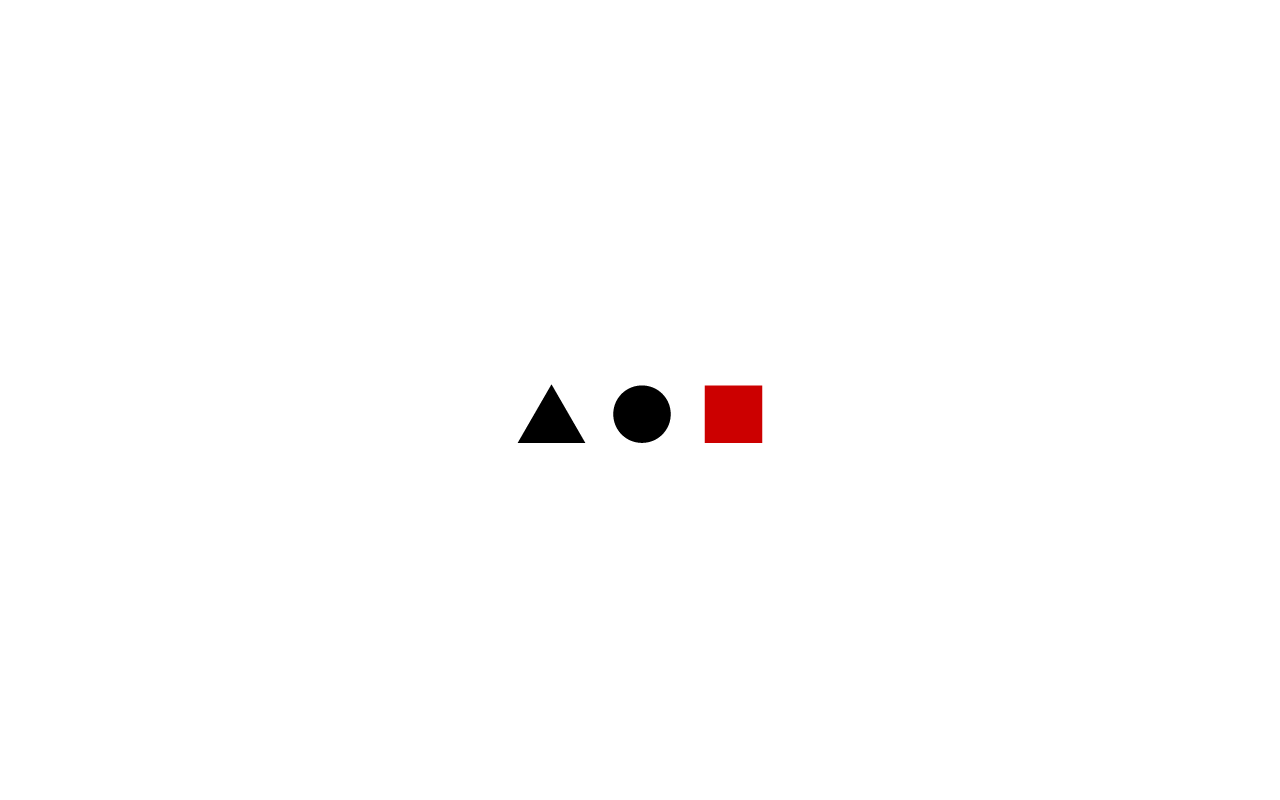
The shapes each have meaning and intention as it ties back to the brand. The triangle represents stability and the process of development. The circle represents both motion and wholeness. The square represents structure and balance. The square sometimes gets a bad rap, so we chose to give it some pop with the brand color.
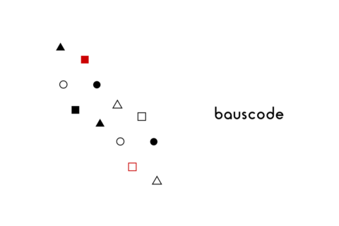
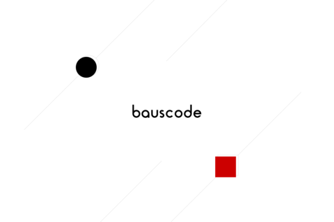
Another stylistic variation using the logo and shapes.